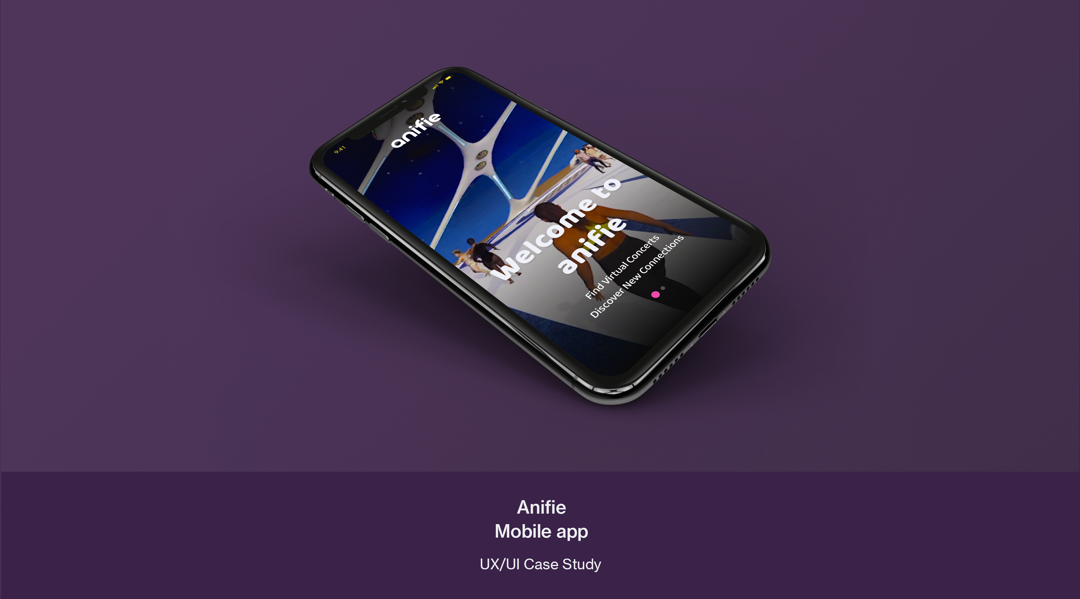
PROJECT DETAILS
Client Project l 4 WeeksThis is an Client project spanning four weeks. The goal of the project was to redesign the Anifie interactive virtual concert mobile app. The scope of the project covered User Research, applying a new UI style guide and creating a new Onboarding process.
Role
Lead UX/UI DesignerTeam
Sarah & BonnieDeliverables
- UX Research
- User Journey & Empathy Map
- UI Style guide
- Mobile site map, red routes
- Mobile User Flow
- Responsive High-Fi Prototype
About Anifie
Anifie allows fans to support their favorite artists by attending interactive virtual concerts, volunteering, streaming and creating new friendships.
Stakeholder Interviews
Interviewing the stakeholder has helped us to identify the right audience for the product and characteristics about the study of participants. As with every product or service, the best offering comes from carefully identifying the target audience, their needs and their wants.
Why Redesign?
Context
Fortnite virtual concerts attracted >10 million concurrent users.
They are for gamers who enjoy PvP shooting games.
Anifie is for:
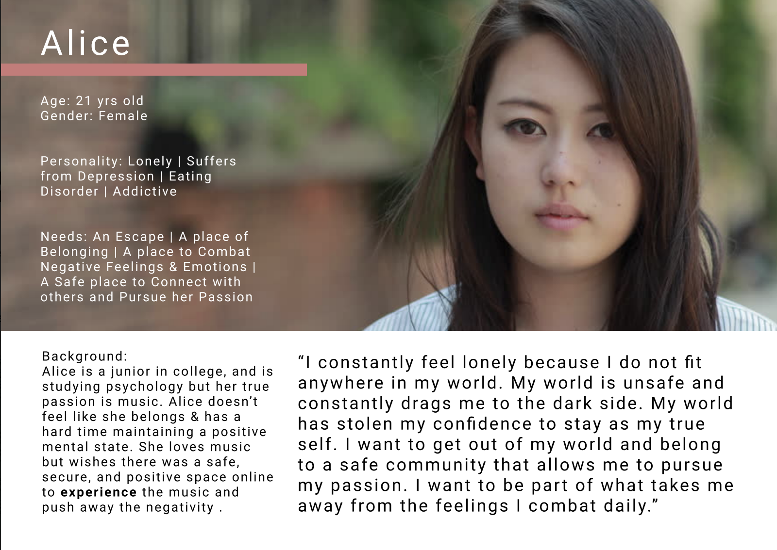
Female mobile users of about 21 years old who are searching for a sense of belonging and escape from the struggles of their everyday lives & loneliness, and looking for a safe place to pursue their passion for music & build friendships.
Comparable companies
Fortnite virtual concerts, WaveXR, IMVU, Sky: Children of the Light.
Business model
Ticket sales and virtual goods sales.
![]()
Design Process
![]()
Behind the ScenesFortnite virtual concerts attracted >10 million concurrent users.
They are for gamers who enjoy PvP shooting games.
Anifie is for:
Female mobile users of about 21 years old who are searching for a sense of belonging and escape from the struggles of their everyday lives & loneliness, and looking for a safe place to pursue their passion for music & build friendships.
Comparable companies
Fortnite virtual concerts, WaveXR, IMVU, Sky: Children of the Light.
Business model
Ticket sales and virtual goods sales.
Goals and Motivations for Redesign
To deliver a personalized experience and intuitive user interface.
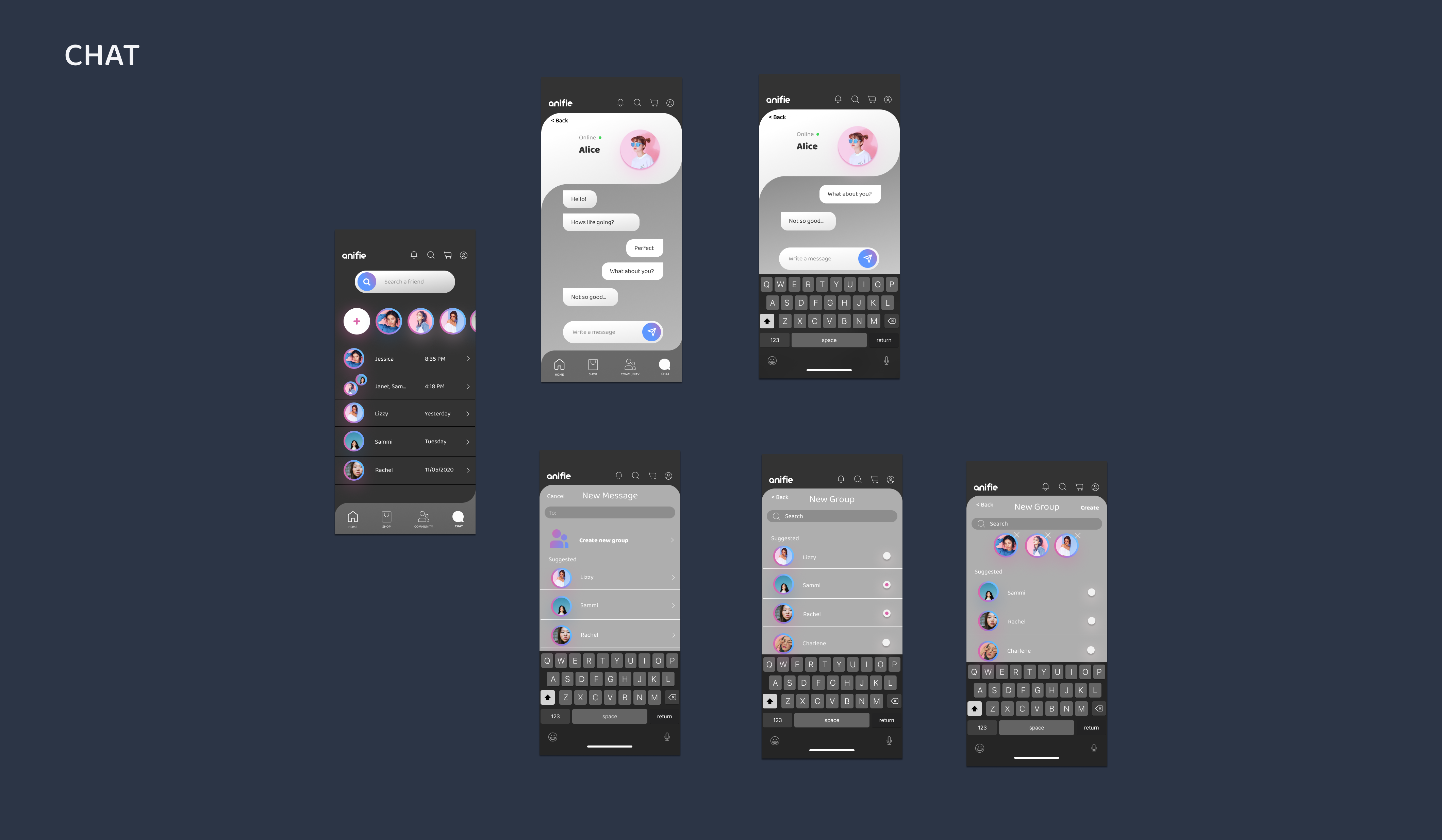
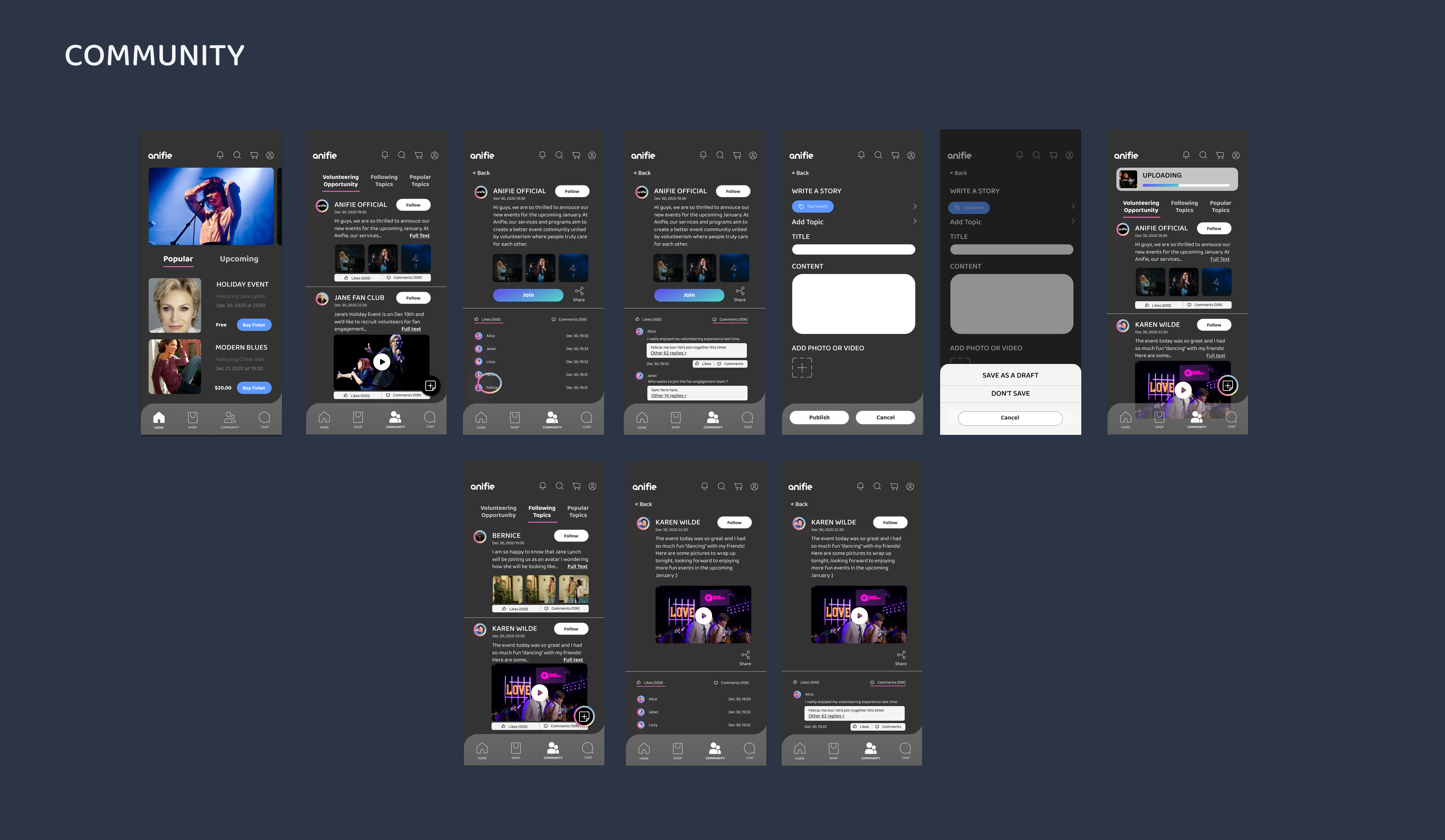
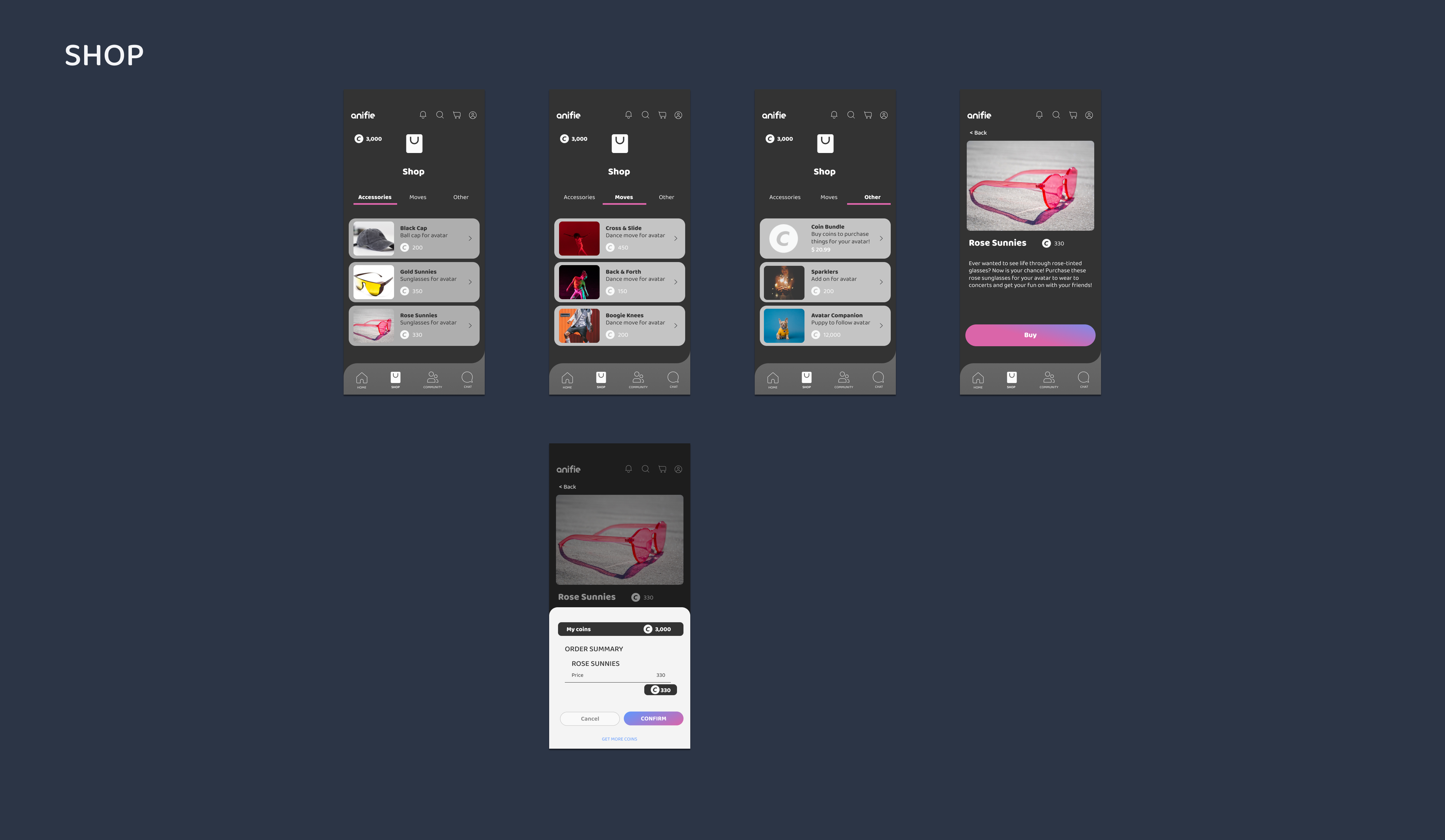
Propose a more engaging and seamless UI experience so that users are comfortable accessing the Virtual concert, Shop, Chat and Community features.
To deliver a personalized experience and intuitive user interface.
Propose a more engaging and seamless UI experience so that users are comfortable accessing the Virtual concert, Shop, Chat and Community features.
Design Toolkit

Design Process

Now we’re going to talk about our persona, user journey map, sitemap, Style guide, wireframes and user research. We’re going to dive right into the visuals and explain our reasoning along the way.

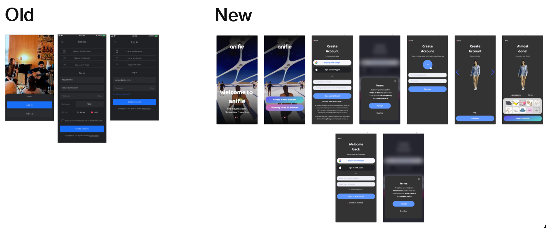
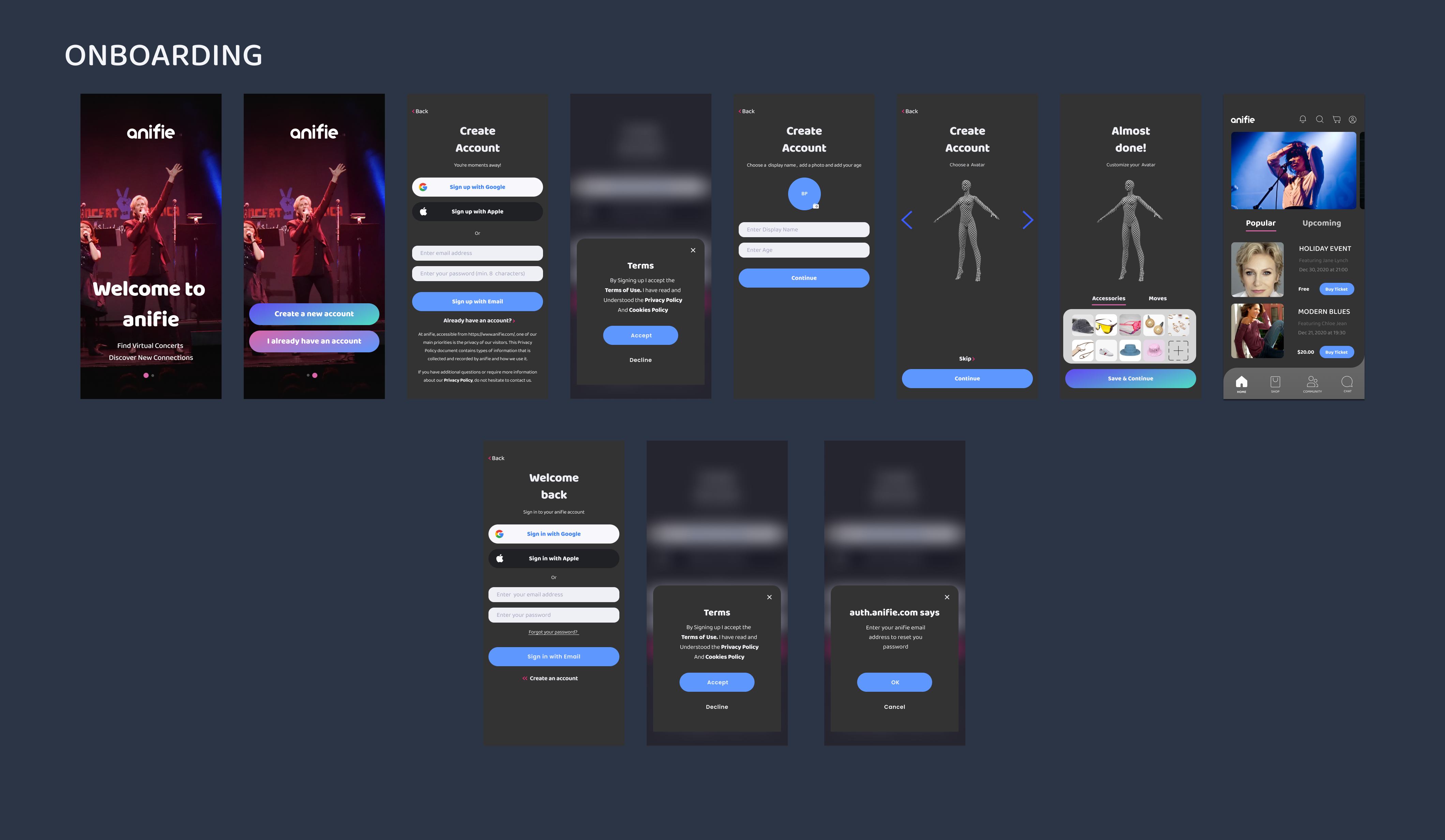
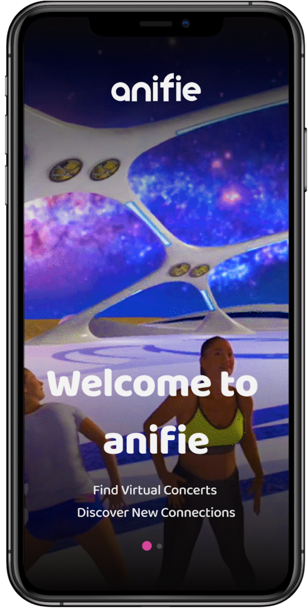
Current Onboarding
While Anifie’s opening screen is not very visually interesting, it also does not position the app’s central use case.
We aimed to create a new onboarding process that would inform the user what the app was about and also drive interest towards creating a custom avatar at the very start so that the rest of the apps features can be explored

Onboarding
Assuming that the new design would be implemented and shipped to the world, how would the app onboard the users?
Here is a quick visual difference between the old and new screens.
Define
Using the target user we generated a User Persona and User Journey Map.

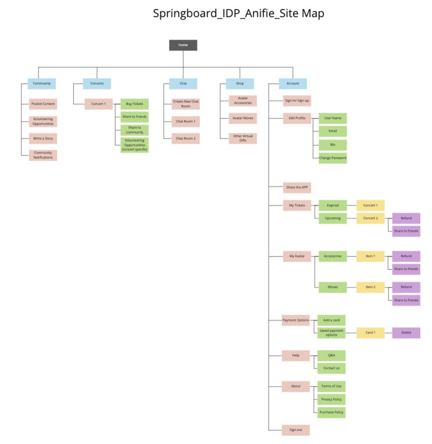
Discover
In this stage, we decided to make a sitemap so that we could better understand the user’s paths and the platform’s structure.
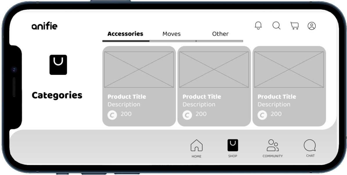
Ideate: LoFi Wireframes
We started with LoFi designs to really test the UI with the target user group.


Test: LoFi Prototype
The Lofi prototype helped us evaluate whether users understand what the app is about and to Identify barriers while participants are doing the main tasks.

The Stakeholder wanted to validate whether or not the user preferred vertical UI or horizontal UI so we created a horizontal LoFi prototype to test alongside the vertical LoFi prototype.
Research: LoFi Prototype
GOALS
The purpose of the LoFi usability testing is to comprehend the overall impact of the environment and how all this assimilates for the user in the virtual environment. We want to answer our prototype questions and validate or invalidate our assumptions with real users. From this user testing, we will have gathered insights from users and validated our ideas.
HYPOTHESIS
- It is easy to understand what this app is.
- Users will find all the resources easily.
- Users will prefer Vertical display, for main interactions and Horizontal for In-concert view.
The method for the usability testing was a full day of moderated 1:1 user interviews. We used Figma for the prototype and recorded our interviews.
PARTICIPANTS
Five participants were interviewed for the usability test. All of the participants were found by contacting people from each of the team members networks between the ages of 20-30 years old.
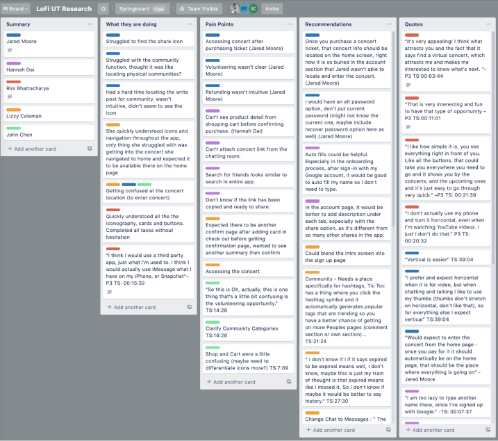
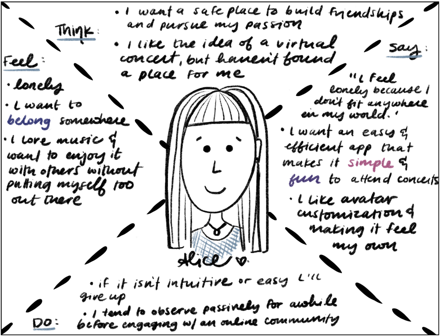
We then created the Empathy map and Affinity map to visualize the qualitative data and key findings.
Research: Quotes
"It's very appealing! I think what attracts you and the fact that it says find a virtual concert, which attracts me and makes me interested to know what's next." –P3
"I prefer and expect horizontal when it is for video, but when chatting and talking I like to use my thumbs (thumbs don’t stretch on horizontal, don’t like that), so for everything else I expect vertical" –P1
Research: Affinity Map & Empathy Map
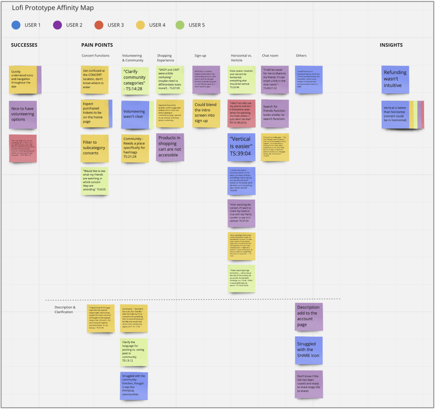
KEY INSIGHTS
- Refunding Tickets was not intuitive.
- Participants preferred vertical screens for main user interactions and horizontal for the concert view.
- Participants wanted purchased tickets to be visible on Home screen
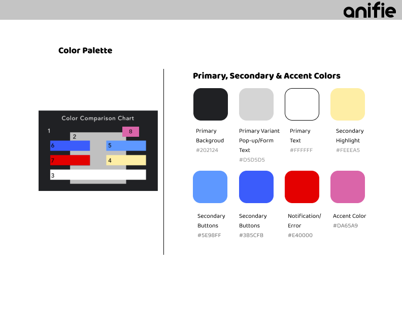
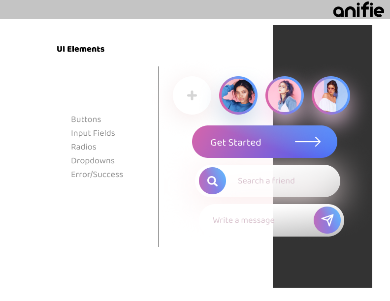
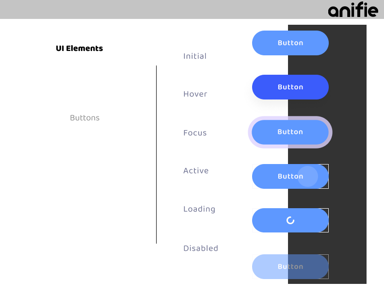
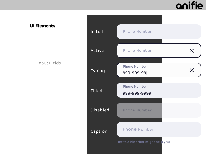
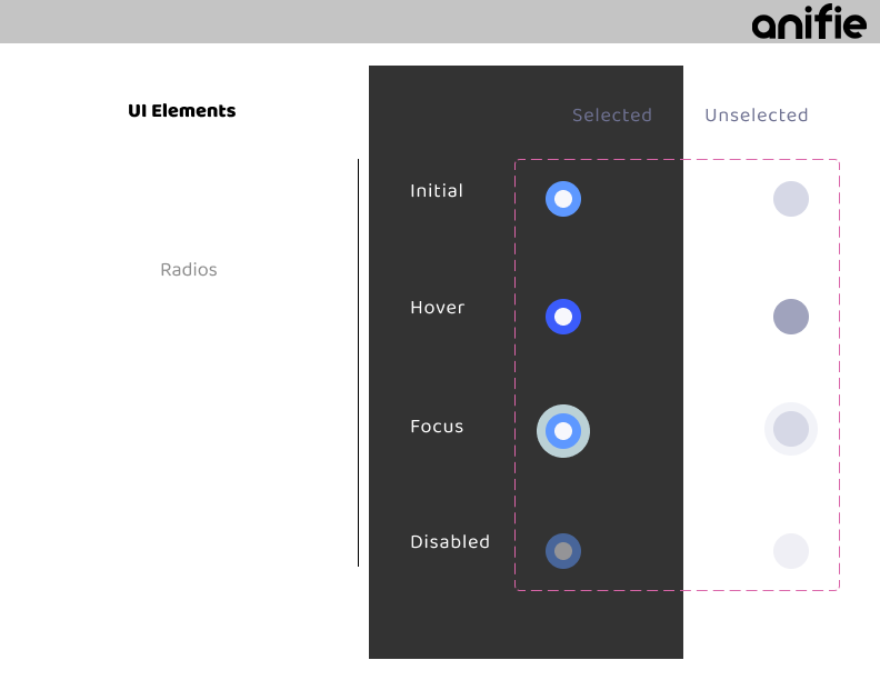
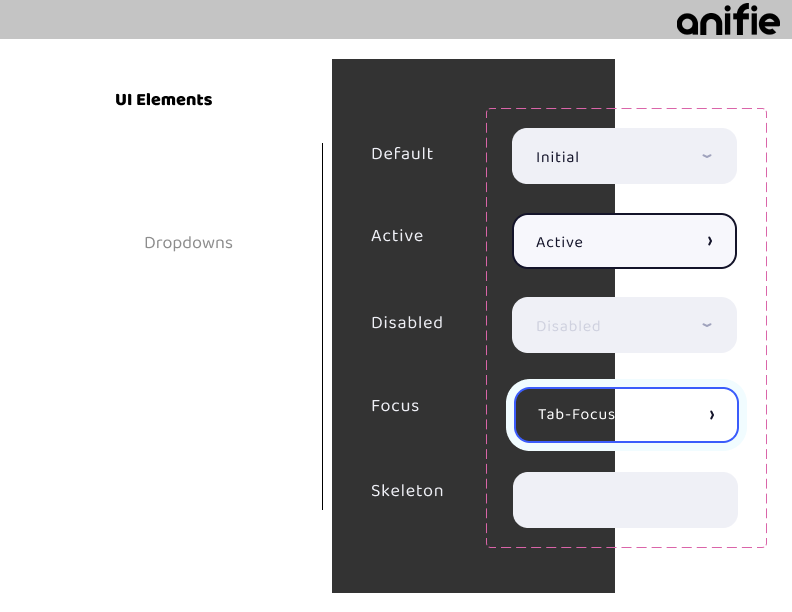
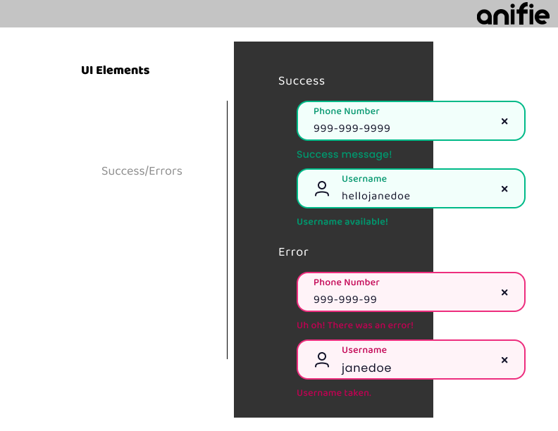
Styleguide
- Main choices made in the Style guide:
- Use similar colors from the original platform so that it would be easy for existing users to identify the elements;
- In all fields, we added labels for better accessibility;
- We defined the primary and secondary action buttons to facilitate the user’s understanding of the platform;
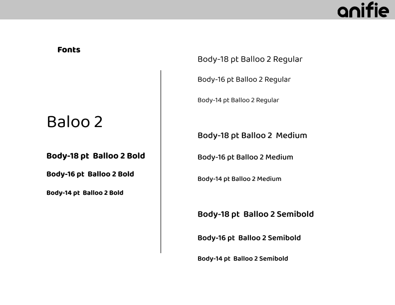
- We selected Baloo as our only typography and used it’s variation to organize the information;
- We used Pegasus Design System to easily complement our design.


Iterate: HiFi Designs V1
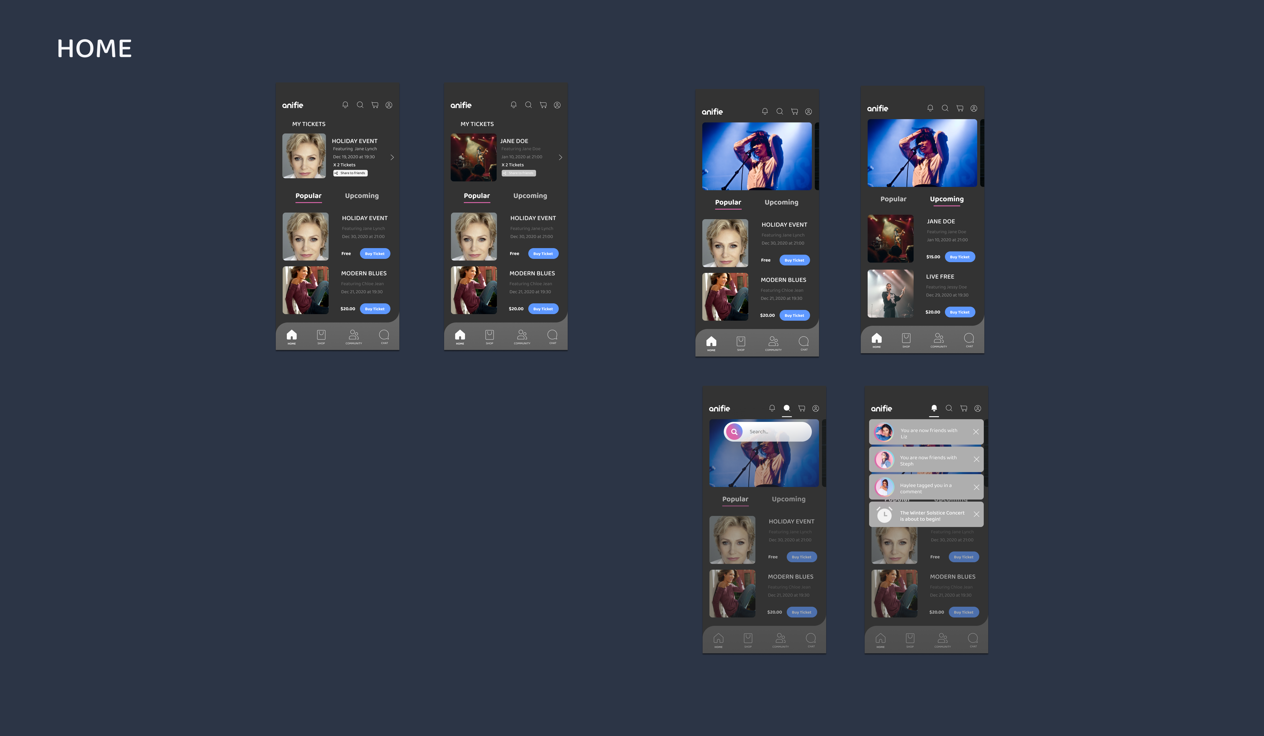


We made adjustments to the home screen and the refund ticket interactions based on the LoFi research results.

Test: HiFi Prototype
We collected great feedback from the LoFi Prototype and started the development of the high fidelity prototype. The HiFi prototype helped us evaluate the second round of research and testing for our final iteration. This whole step was made in Figma.
Research: HiFi Prototype
GOALS
The purpose of the HiFi usability testing is to validate or invalidate updates made to the environment based on the first round of testing.
HYPOTHESIS
- With an up to date onboarding process users will find the experience exciting and easy to login/sign up.
- Target users will find the navigation simple and intuitive.
METHOD
The method for the usability testing was a full week of moderated 1:1 user interviews. We used Figma for the prototype and recorded our interviews.
PARTICIPANTS
Eight participants were interviewed for the usability test. All of the participants were found by contacting people from Anifie and each of the team members networks.
Research: HiFi Prototype Quotes
"This is super straightforward" (in ref to onboarding process) –P1
"Colors feel familiar and good, it seems very minimalistic, doesn’t seem complex" –P3
"It’s all self-explanatory, and user friendly" –P4
Research: HiFi Prototype Affinity Map
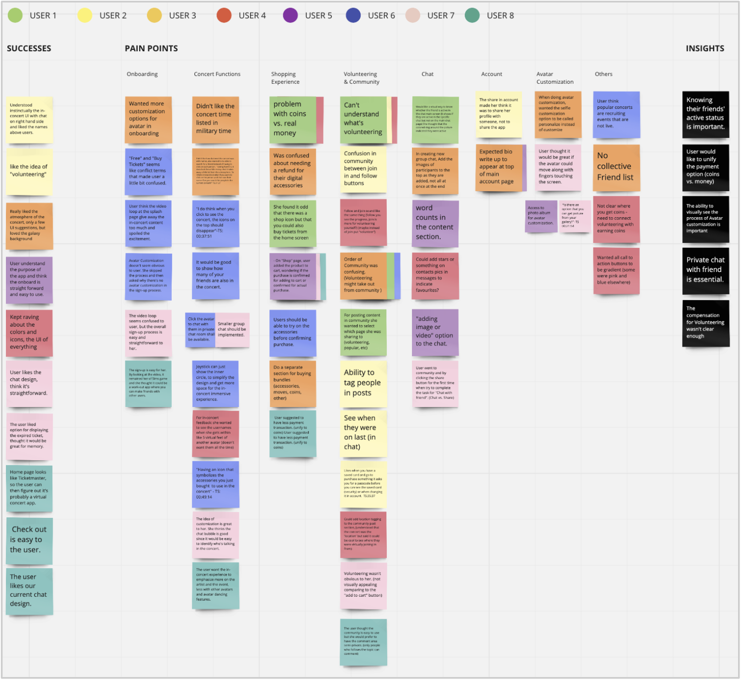
KEY INSIGHTS
- Knowing their friends' active status is important.
- User would like to unify the payment option (coins vs. money).
- Private chat with friend is essential.
- The compensation for Volunteering wasn't clear enough.
- The ability to visually see the process of Avatar customization is important.
Stakeholder Asks
Along with the HiFi Prototype research key insights, the stakeholder had additional feedback for us to consider.
Along with the HiFi Prototype research key insights, the stakeholder had additional feedback for us to consider.
- Volunteer Opportunities are not shown (is replaced by "follow us" feed)
- Getting a phone address book is a No.1 growth hack for mobile app user acquisitions.
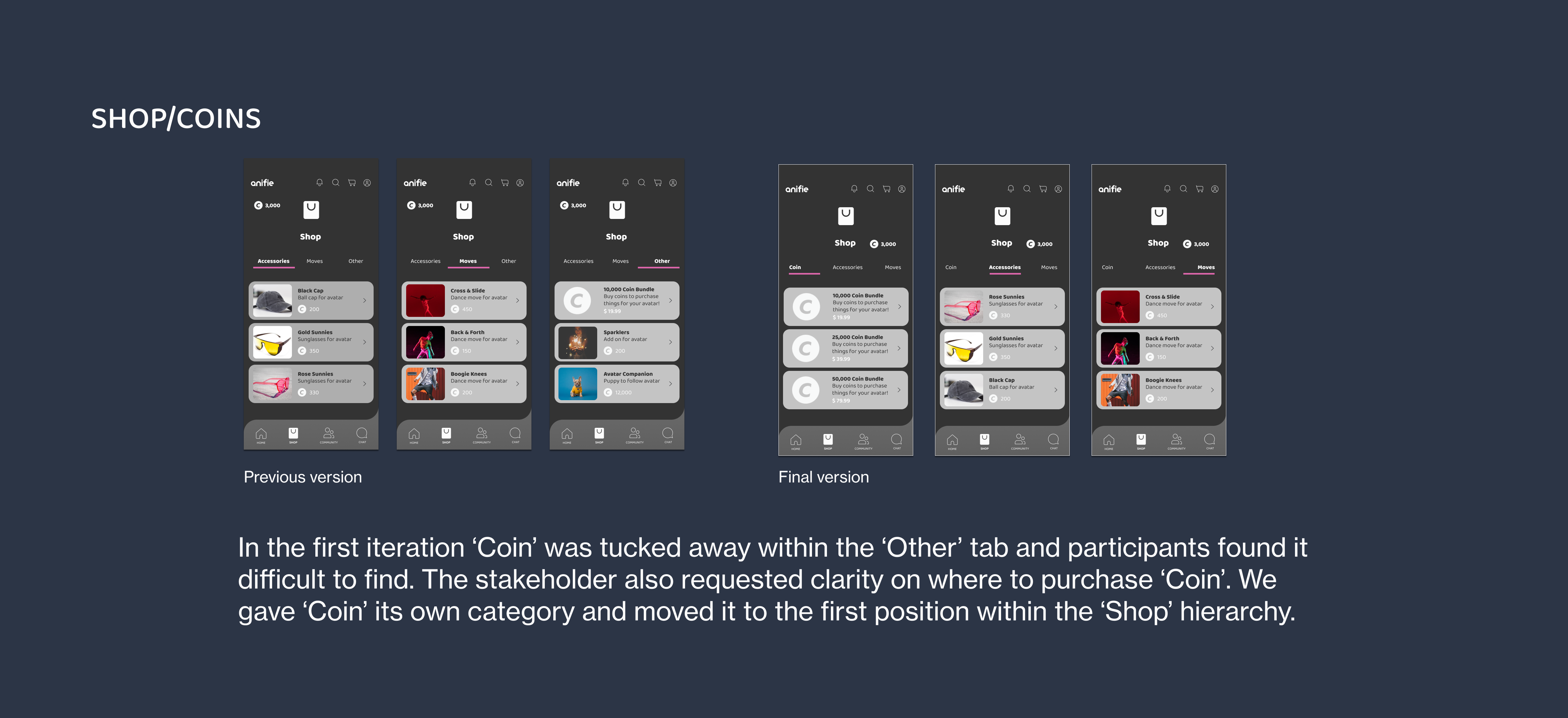
- Clarify where users can purchase ‘Coins’.
Final Iteration
After rapid testing with a few of my collogues I updated my wireframes based on some reccomendations and created another LoFi prototype.


Final Prototype
With all the final iterations incorporated, the final prototype was created. Click the link to have a look!
Next Steps
Why settle for usable when we can make interfaces both usable and pleasurable? With high competition and a constantly growing number of mobile apps devoted to interactive virtual environments, the first impression cannot be just nice and clean. The successful app, in this case, should instantly appeal to the emotional and aesthetic sides of user perception, be simple to use to engage the user from the first seconds and let them interact according to their personal preferences. That’s the balance our team strived for in the case of Anifie mobile app.
Anifie can move to use our UI template and modify copy as they see fit. It is advisable to conduct more research with A/B testing and also to test further when it comes to the in-concert experience.
Thanks
A big thanks to my team, Bonnie and Sarah.