Typography
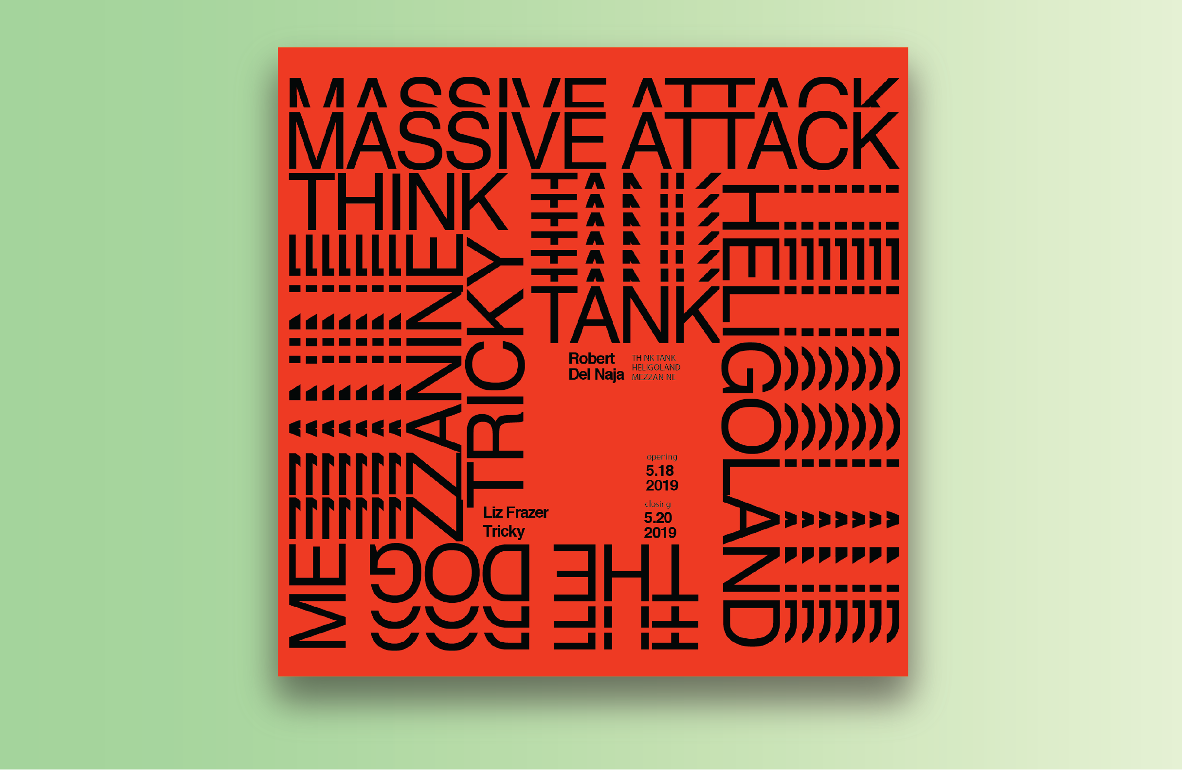 Massive Attack Album Cover: 12x12 inches print 964x964 pixels web graphic
Inspired by Wolfgang Weingart, using limits of legibility and repetition to produce the Swiss Punk Typography effect from the late 1960s. Experimenting with placement and repetition of the type I aimed to create a convergence towards the center section of negative space of the albums names in order to exhibit all of Massive Attacks’s work.
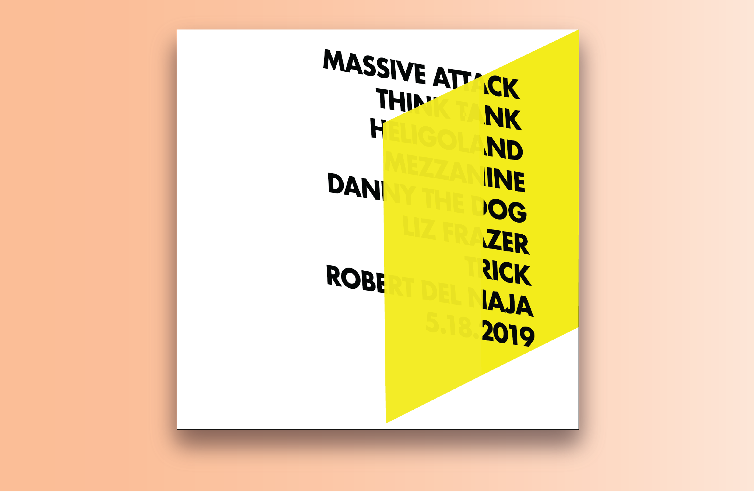 Massive Attack Album Cover II: 12x12 inches print 964x964 pixels web graphic
Inspired by Swiss modernism, using a rectangular shape I created an illusion of the type traveling through the object. The readability of the type follows F-pattern reading, which enables the view to properly scan the text left to right and focusses their concentration. Started off with intial sketches which later translated to the final design in Ilustrator.
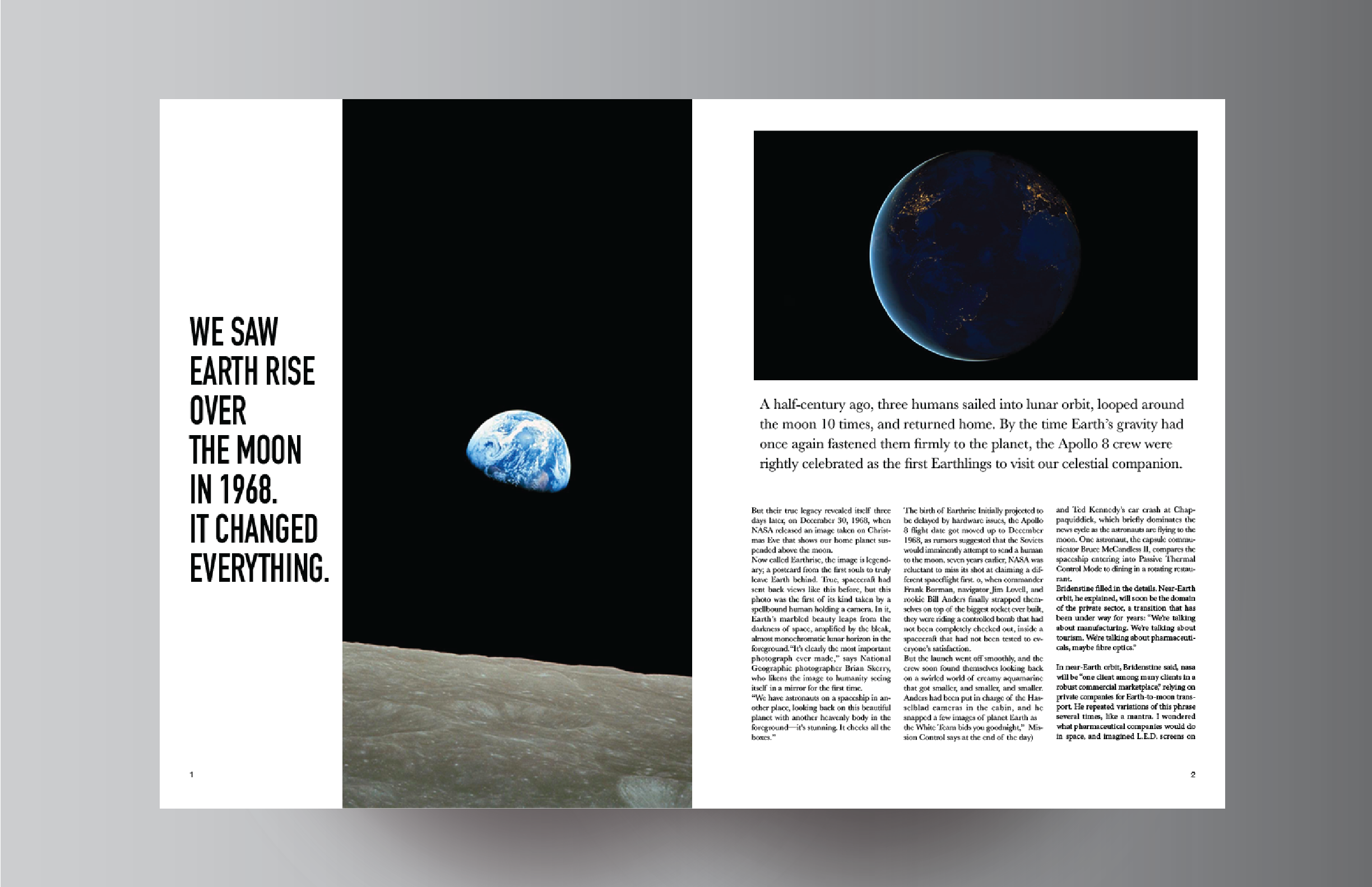
Moon landing magazine spread 2 pages print
Using Josef Muller Brockmann’s grid system, this spread uses a three column grid along with a baseline grid. The three columns are used instead of two columns in order to provide readability with proportional widths. Each line does not have more than thirty-five characters to maintain the user’s concentration. The basline grid helps create a reading rhythm since there is a lot of text that is being displayed in the design.
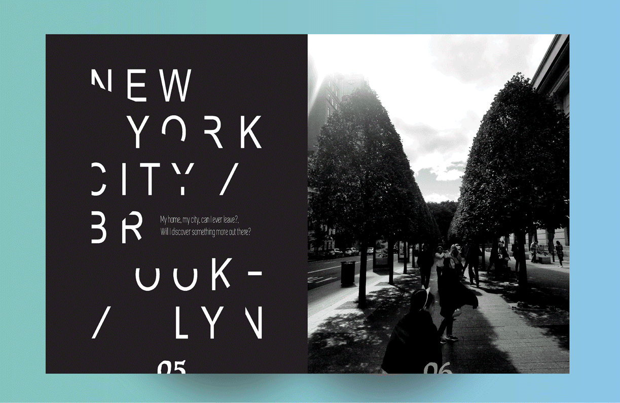
Editorial spread 14 pages, print
This work explores my intial discovery and transition into design. Many of the pages include isometric shapes with gradients used in an abstract way in order to explore my personal development with design. The Typography mostly follows left alignment for a clean modern look and feel.

Poster 11x17 inches inkjet print
This peice aims to be an experimental design. As an exploration peice it combines modernist and post modernist concepts. Using a modular grid in the section with the text the, equal size modules provide a comfort when reading. This makes it easier to “break the rules” and use the spatial zones in different ways. The graphic provides flow as well as direction with the ripples moving towards the text.
Home